探索 iOS 开发的 5 种 UIStackView 分发类型
Fill 充满
This is the default distribution type when you create a new UIStackView. In my test example for Fill, I am using UITextFields and UIImageViews and grouping them in a horizontal UIStackView. UITextFields do not have much of an intrinsic content size—they pretty much collapse down to nothing if you have no text inside them. This will help me demonstrate what effect the Fill type will have.
这是创建新 UIStackView 时的默认分布类型。在 Fill 的测试示例中,我使用 UITextFields 和 UIImageViews 并将它们分组在水平 UIStackView 中。 UITextFields 没有太多的内在内容大小——如果里面没有文本,它们几乎会崩溃到什么都没有。这将帮助我演示填充类型将产生什么效果。
When you place your controls inside a UIStackView with Fill set as the distribution, it will keep all but one of the controls at their natural size and stretch one of them to fill the space. It determines which control to stretch by noting which one has the lowest Content Hugging Priority (CHP). I added a spacing of eight between the UITextFields so you could see the size of each one.
当您将控件放置在 UIStackView 中并将 Fill 设置为分布时,它将保持除其中一个控件之外的所有控件的自然大小,并拉伸其中一个控件以填充空间。它通过记录哪个控件的内容拥抱优先级 (CHP) 最低来确定要延伸的控件。我在 UITextField 之间添加了 8 的间距,以便您可以看到每个字段的大小。

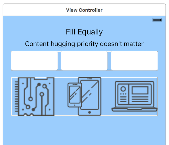
Fill Equally 均匀填充
With this type, each control in a UIStackView will be of equal size. All of the space between the controls will be used up, if possible. I added a spacing of eight between the UITextFields, so again you could see the size of each one. With this type, the CHP does not matter, because each control is the same size.
使用这种类型,UIStackView 中的每个控件都将具有相同的大小。如果可能的话,控件之间的所有空间都将被用完。我在 UITextField 之间添加了 8 的间距,因此您可以再次看到每个字段的大小。对于这种类型,CHP 并不重要,因为每个控件的大小相同。
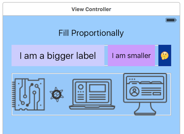
Fill Proportionally 按比例填充
This type was fun to explore. It is hard to see the effect this type has until you play around with different phone sizes and orientations. The UIStackView will ensure the controls maintain the same proportion relative to one another as your layout grows and shrinks. I switched from using UITextFields to UILabels in my test.
这种类型的探索很有趣。除非您尝试使用不同的手机尺寸和方向,否则很难看出这种类型的效果。 UIStackView 将确保随着布局的增大和缩小,控件之间的相对比例保持相同。我在测试中从使用 UITextFields 切换到 UILabels。
Unlike the previous two settings, the Fill Proportionally distribution needs the controls to have an intrinsic content size. The Fill and Fill Equally distribution tell their child controls how big they should be, but this one is the other way around (as long as there is enough space for all of your controls to be their natural size).
与前两个设置不同,按比例填充分布需要控件具有固有的内容大小。 “填充”和“填充相等”分布告诉其子控件应有多大,但此分布则相反(只要有足够的空间让所有控件达到其自然大小)。
This is what the distribution looks like for portrait and landscape.
这就是纵向和横向的分布。

As you can see, the proportions for the images and labels are maintained for the different layout sizes.
正如您所看到的,图像和标签的比例针对不同的布局尺寸保持不变。
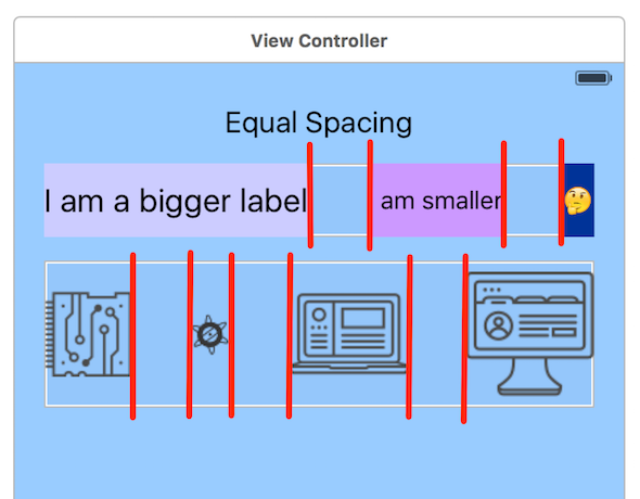
Equal Spacing 等间距
This distribution type will maintain an equal spacing between each of the controls and will not resize the controls themselves. I have illustrated this by drawing red lines to indicate the equal size of the spacing between the labels and the images.
这种分布类型将在每个控件之间保持相等的间距,并且不会调整控件本身的大小。我通过绘制红线来说明这一点,以指示标签和图像之间的间距大小相等。
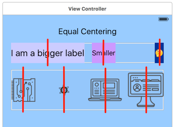
Equal Centering 等中心
Finally, the last distribution type is a little hard to see without an illustration. It will equally space the centers of the controls. To illustrate this, I drew red vertical lines down the center of each control. The distance between the red lines is spaced out equally.
最后,如果没有插图,最后一种分布类型有点难以理解。它将使控件的中心均匀分布。为了说明这一点,我在每个控件的中心画了红色垂直线。红线之间的距离相等。
Those are all of your options when using a UIStackView. They behave quite differently from one another. Some are opinionated about controlling the size of their children, and others let the children be as big as they want and try to space them out in different ways.
这些是使用 UIStackView 时的所有选项。他们的行为方式彼此截然不同。有些人坚持控制孩子的大小,而另一些人则让孩子想多大就多大,并尝试以不同的方式将他们分开。
If you want to explore these types yourself, I have the project on GitHub.
如果你想自己探索这些类型,我在 GitHub 上有这个项目。


发表回复